Such questions are often intended to create an index or scale through a synthetic approach to the investigated phenomenon, but sometimes it is advantageous to present the distribution of responses to sub-questions. An example of a question measured with the same scale (such as ‘I trust a lot’, ‘I trust’, ‘I distrust’, ‘I distrust a lot’) is the question about respondent’s confidence in entities enumerated by the researcher. To avoid analysing results for each assessed item separately, you can build a single summary table where the results can be easily read and compared. An example of a table for questions measured using the same scale may look like this one:
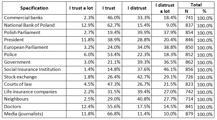
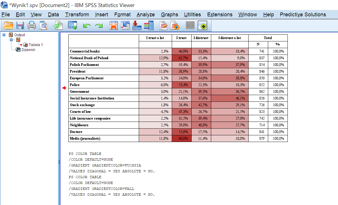
Table 1. Public confidence Source: Own research
This table can be easily built in PS IMAGO PRO, andrequires proper data preparation, first and foremost. It is important that the labels of variables be consistent across all the variables in question. Even small differences such as an additional space in a variable label will prevent the application from recognising the common label source of table columns. Before building the table, make sure the measurement level is the same, missing data is defined, and whether it is the same for all scale items.
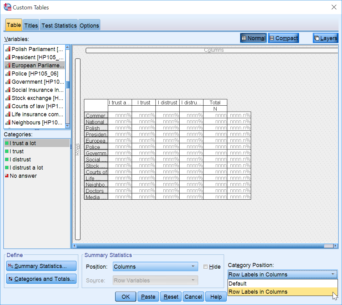
Having verified the data, you can start the table builder. Go to Analysis > Tables > Custom tables. Select the variables to make up the scale from the list of variables and move them (all together) to the Rows area in the workspace panel. How can I do it? First, select multiple items on the list by pressing shift and clicking the first and last variable to be selected while holding the key. After selecting the variables, click and hold the LMB (left mouse button) and move the cursor to the row area in the workspace panel until it is surrounded by a red edge and the cursor turns into a hand. You can then ‘drop’ the variables.
The list of variables in the table should look like this:

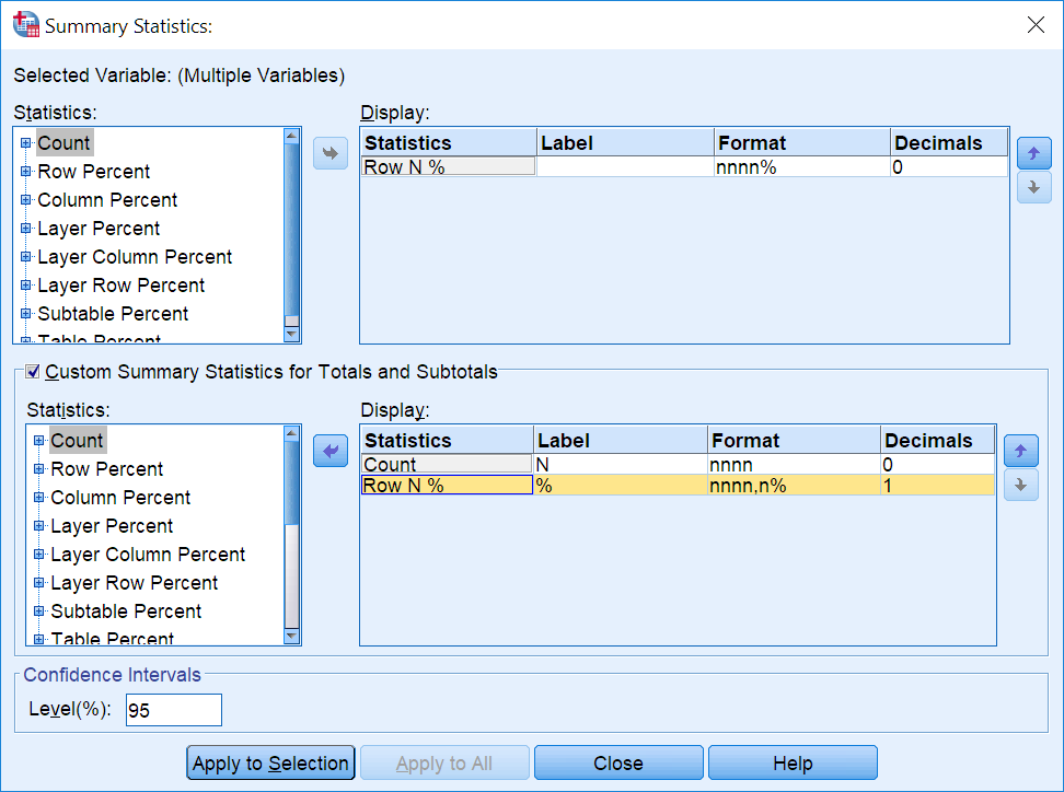
Using the Summary statistics button, you can specify the type of percentage to be displayed.. In this table, we will use the row percentage. Remove the default count for the table and select Percentage in rows and then %N in a row on the left-hand side. After adding the percentage type, remove Count from the Label field. The table should also have columns with total summaries (percentage summary and count). To do this, tick checkbox Custom statistics for total summaries and intermediary sums and add percentage in rows. This option allows you to control the percentage base for each variable. Be careful when comparing distributions of valid observations between variables if their counts differ.
Accept the percentage changes and go back to the main window of the table builder and then to Categories and summaries and select checkbox Total summaries in section Show. This will add the Total column to the table. There is one more important change, which will help you compare results of individual scale items. The transformation involves moving value labels from rows to columns in the main window of Custom tables. To do this, select Category position > Row labels in columns from the drop list.
Finally, to help identify the most popular responses, you can use the table colouring option of PS IMAGO PRO to add gradient colouring to the table cells. The resulting colour intensity depends on the value in cells, which makes it easier to quickly read results. The resulting table is very easy to read. It can be moved to a report or a document with a description of research results.